The contact form of an online store is one of THE most important part of any ecommerce system, but it is a page still too often neglected.
In this Prestashop-thirtybees tutorial we will be looking at the Importance of the Contact Us page
The contact us page main purpose is to generate leads from your website. Often, it is used to ask for feedback, or for visitors to leave you an inquiry. Sometimes it is a good way to encourage people to sign up for a free gift or newsletter. It’s also a convenient way for visitors to leave you a message anytime.
In a way, the contact us page doubles as a salesman for you. It is one of the primary link between you and the customer. We will try to keep things intuitive, meaningful and enjoyable for potential customers. Let’s try to improve it together.
Make the contact page more dynamic
As mentioned above, the contact us page is one of the most important part of an ecommerce website. Being that, a lot of customers, like me, often uses it to get more information and resolution of customer issues. But few merchants takes ample time to modify the default contact page. This is a shame! Personally as a customer, it always makes me a little afraid to buy on a shop where the contact page only contains 4 fields, a send button, and nothing else.
It does not take much to make the contact page a little more dynamic, a Google Map, company details and an image of your office / warehouse are enough to make you credible in front of an undecided buyer. Buyers on the internet want to be sure they have someone who can help them when they have problems with their purchase.
The optimization that I propose you through this tutorial, concerns only the display of the page without adding additional fields. Also note that this optimization helps to convince the buyer on mobile, by showing him the details of your company.
The objectives of this prestashop-thirtybees contact us page tutorial is are as follows:
– integrate Google Map
– integrate the company’s contact details – integrate the corporate
image
Understand the rule of the Boostrap grid
Structuring the integration
– use the rule col-md-6
– adjust the message field
– adjust the position of the button of the form
– integrate the information of the company
Balancing and adjusting the form
Test form validation
Locating and Working the contact-form.tpl
To locate the file we are going to be working on to be able to customize the contact page. Go to your prestashop-thirtybees installation folder, open the themes folder, then open the theme that you are using – in my case its niara theme. You should be able to see the file contact-form.tpl on the lists. Open it in your code editor. I am using VS Code for my code editing work.

Once the file is opened in your code editor, look for this line of code:
<div class=”col-xs-12 col-md-3″> and <div class=”col-xs-12 col-md-9″>
<div class=”col-xs-12 col-md-6″>
Understand the rule of the Boostrap grid
Prestashop and thirtybees both uses the bootstrap grid system. The bootstrap grid divides the page or any element into 12 columns.
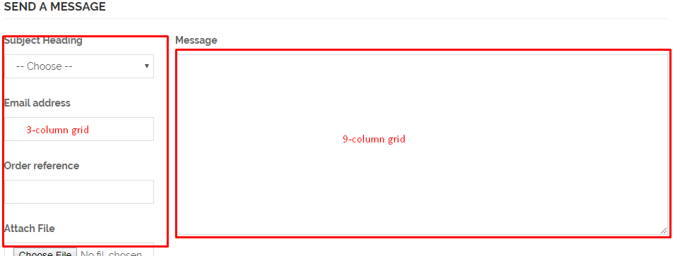
So, in the default html, the containers for the form is on a 3-column and a 9-column grid.

We want to give it a 6-column by 6-column grid layout, like so!

Next is to copy the code for the Message field, like the one seen below:

and paste it here:

This will make the form all nested in one column of a 6-column grid, like so. Go to the page and refresh to see the changes. The new contact us page should look like the image below:

Integrate the company’s contact details
Now, enter in your company or business contact details like company name, physical address, phone number, and email address, like so.
Integrate Google Map
Go to maps.google.com and type your business address, then click on share icon, then click Embed, like so.

Copy the code and paste it below the address details, like so.

Save your work, and refresh your contact us page!
Fixing the submit button and testing for validation
At this point, your form will probably not work. This is because the Submit button is not positioned properly in the code. To fix this is simple. Just copy and paste the submit code into the bottom of the contact form below the message field.

Save the file and refresh the contact page, then test it. Everything should be alright at this point!
Our Contact Us page now looks a lot more dynamic and user-friendly!

Find great resource and prestashop-thirtybees tutorial lessons here:
How To Change and Customize Your Websites Horizontal Menu
Does this prestashop-thirtybees contact us page tutorial been helpful? Let us know in the comment section.


