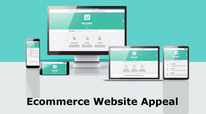
Make your ecommerce website more appealing to customers, because your website is the brand ambassador for your company. Your website should look good and paints your company in the best light possible.
Because a combination of functionality and visual appeal will make sure that both you and your visitors get the most out of your site. And it also builds the foundation for an exceptional user experience.
Make your ecommerce website more appealing by Paying Attention to your Fonts choice.
Fonts are a quick and easy way to change the look and feel of your ecommerce website. Your choice of fonts can make your ecommerce website look more fun, more goofy, more serious, or more down-to-business, or just simply – bad.
Check out this comment from an authority in design:
“Typography is the detail and the presentation of a story. It represents the voice of an atmosphere, or historical setting of some kind. It can do a lot of things.” Cyrus Highsmith
Back in 2008, researcher Harald Weinreich & Jakob Nielson published a study that measured 45,237 page views from 25 different users, and found that – of the people being analyzed – most people would scroll about halfway down the page for longer content and only spent enough time on the page to read less than 20% of the text.

“In the full data set, the average page view contained 593 words. So, on average, users will have time to read 28% of the words if they devote all of their time to reading. More realistically, users will read about 20% of the text on the average page.”
Does this mean we have to create shorter articles? No, not at all.
The reality of the situation is, asking about “the best typeface” is going to be about as fruitful as asking “what color converts the best?”. The question you have to ask is if the font you are using accurately reflects you?
Make your ecommerce website more appealing with a user friendly background and colors.
Backgrounds can be simple or sophisticated, ranging from just a single color tone that’s easy on the eyes, to a photo that’s enticing and mesmerizing.
The average person takes around 90 seconds to form either a positive or negative interaction with your website. According to a study conducted by the University of Winnipeg in Canada, up to 90% of a person’s assessment about your site is based on colors alone.
Top 4 color backgrounds used in todays website that make your ecommerce website more appealing.
.White is critical for displaying text at just the right contrast so as to make your site’s words, sentences and paragraphs more legible and easier to read.
Blue is seen as the color of communication, intelligence, and calm reflection.
Black used in web design can also represent sophistication, glamor, security, and efficiency.
Gray represents strength, power and authority, gray makes for excellent shade that will go with most colors. You will notice that gray is used a ton in web design today.
Use Big Images to make your ecommerce website more appealing.
The human population is made up of 65% of visual learners. This means that we can influence 65% of consumers using images.
One of the easiest ways to make your website really standout, look more professional, and increase user engagement is to use big, high-quality, beautiful imagery.
Keep your website simple to make your ecommerce website more appealing.
Simplicity is beauty. No one likes a cluttered site – it’s hard to look at, and even harder to navigate. Your website should be kept clean and clutter free, well organized, and great at directing users exactly where they need to go.
Make it Easy for People to Learn More About You
One of the simplest approaches to make your site look considerably more expert is to have a segment where individuals can discover joins for finding all that they have to think about your business.
Make your ecommerce website more appealing by using Basic Logos
Logos that are complex – with too many colors and too many different fonts – can be distracting to a first-time visitor to the site. Instead of going for something too bright or too bold. Go for the most basic, dependable looking logo.
Do Design Research for better ecommerce website appeal
There is no perfect website design, and we will never see anything like that in a lifetime, but to continue to get better by studying designs principles. Imporving the user experience of your ecommerce website will bring a lot of freshness to your otherwise dull ecommerce website.
In Conclusion
Your ecommerce website is like your presentation of who you are that is open 24×7. It is the cheapest and the easiest way to put your product out there. Make your ecommerce website more appealing by following the mentioned tips.
That is why 55% of the inbound marketers consider growing company’s website as their topmost priority, so we do our best here at shoptech.media.
Comment as much as you can if you agree or disagree to the points regarding Best Tips To Make Ecommerce Website More Appealing.
Click the Social Sharing buttons below and share on your wall, like so.


