Right now everything in my head is changing, the vision of the web I imagined 10 years ago is not what it seems to be today. To be honest, I am sincerely surprised that more and more ecommerce websites fail to break through considering that more and more people are buying online. I have seen a lot, and I mean a lot of them starts so promising, only to fold everything up within months. And then, I stop to wonder why? They seem to have done everything they could have done to properly sell and market the products, yet ended up with empty pockets.
Have you started to wonder why some sites work very well and others do not? Is the reason about money? Maybe it is! But quite frankly, it might not! Or are there a much deeper reason to this madness?
We Used to NOT care about emotions
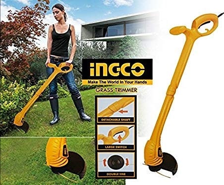
Some time back, if somebody told me that it takes emotion for a website to be effective, I would have replied “we don’t care, we just want to sell”. .However, it is well documented that it is always easier to sell to someone who is already emotionally attached. Just take for instance a beautiful girl who is promoting “ingco grass trimmer/cutter”. See photo below.
There is a reason why it is not a man but a beautiful girl is modeling it. “Oops … suddenly you bought them without understanding anything ( ‘your wife will be happy ahah)’.

Do you see what I mean here? In today’s stiff ecommerce competition, it is not enough for people just to “want to sell”.
Are you an Airbnb or a Hotels.com?
To go to Hotels.com is always a chore for me … the site is “bland”, it’s teeming with promotions, and it’s feels crowded. I go there to find the room the cheapest possible and closest to my point of destination.
Honestly, the more I can close the deal quickly, the more it suits me … because frankly reserving a room inflates me completely on this kind of site. It’s a bit like shopping, you do it because you have to do it, but if you didn’t have to, you wouldn’t go.
Hotels.com reviews are peppered with not so nice comments
Hotels.com it’s one of those foolish companies, who think they are being smart, by avoiding all feedback from their customers directly. They may have been able to keep me as a customer, but after chatting with a fake robot, and seeing that they have no email to contact, and calling them only to be disconnected because I didn’t match one of their stupid erroneous prompts, I realized hotels.com is a scam artist like company. I wrote a detailed and in-depth review of a hotel I stayed at, the good and the bad. Hotels.com changed my 3 star rating to an 8 star rating, without my consent or permission, and they never posted the paragraphs of text I shared.
Source: hotels.com reviews
While Hotels.com site is “practical and functional”, I have never found the shopping experience pleasant and accommodating.
In ecommerce you have to think in Airbnb mode
All things about airbnb is with an air of renewal. On the booking site, there are several things that strike me… the first thing is simplicity, we are not asked a thousand things… there’s just a big field for research and that’s nice. It must also be said that I like sites that limit actions on the screen … after all, people want to have a vacation, not ride on a fighter plane.
Airbnb interface
Airbnb is not without bad review but the simplicity is off the roof. It only presents a few options. I’m looking for something. I don’t need to say when I come… when I leave… how many people… Basically, where do you want to go? And so I like that, and people like that!
Personally I have never traveled through Airbnb (because I’m not a fan of homestay), but when I browse the site… it’s distracting. Basically I’m looking for the coolest thing I can find … and not a vulgar hotel with 4 walls. Of course I am looking for accommodation, but we are in a different logic … we are looking for an experience, we do not want to sleep in a bed.
Internet users need to feel your store is “real”
This is where airbnb really get it right. Every property listed with them are real and personal. However, being real does not have to mean that the images is amateurish, but it is a good criterion for differentiation.
It’s the same with your ecommerce
Now when people/clients call me I have a new favorite question that I love to ask: “Why will I come to your site rather than another? ” They might say, “well, I have a good price” or “I am a certified dealer of this product..” or “My product is new or revolutionary”. But reality sinks in and the website ends up with no traffic and nobody is buying anything.
To drive the point of what I have been saying: Anybody can do the following: “A product card with a photo, a description … a price everyone can do it”. And it’s totally true, moreover, if you’re just a bad seller, I don’t see any reason how I would want to come to your house.
It reminds us of netizen reporting on social media. The videos and photos might not be of the highest quality, but it’s a real, and not photoshoped or anything edited. We see real people, personal tattoos, the moles are visible… the hairstyle has slight flaws. It’s very clean though … but it breathes authenticity, it is alive.
Yes, ecommerce websites must feel authentic and real!
In conclusions
Ecommerce is a bit like going to the market … you like it when the guy behind his stand makes you taste sausage … “Another slice? Taste this one, it is very good! “… The idea is to awaken the taste as well as emotion.”. Well in ecommerce you will understand it is exactly the same … In the case that I mentioned Airbnb and Hotels.com have radically different strategies … the difference between you and them is that, they have huge resources and you don’t! So do not do like Hotels.com, unless you have protected financially, otherwise you are definitely cooked.
Additional resources
Are You Ready To Start Your ecommerce Business this 2020?
Planning Growth of Your Ecommerce Business: 5 Key Best Practices


