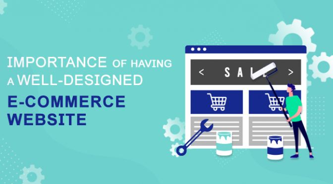
The design of a webshop is an important factor when it comes to developing an e-commerce that performs well. Having a well-designed webshop is not just about making your it look good, but it’s also about optimizing it to help you give your customers a better experience and leading it to make more sales.
According to Smart Insights, 38% of people will leave a website if they find the layout unattractive. Therefore, just like how you would probably leave a store when you saw how messy and disorganized it is, your customers would definitely do the same when they went to your e-commerce website and found a store with a messy layout, low-quality image, mismatched fonts, confusing navigation, and unprofessional design.
Just imagine you are a customer who is looking for a specific item and you landed on a website that claims to be selling that item. Once you landed on that website and didn’t saw any product images that implicate what they are selling or didn’t see any elements that show that they are an e-commerce website, you would probably leave that site in just one glance.
That is why it is important to make sure that your homepage answers these three questions:
- Are you an e-commerce website?
- What do you sell?
- Why should I trust your shop?
Putting elements such as shopping cart icon, login icon, wish list, search box, product images, and even sale banner is vital in making sure that your customers will know that you are an e-commerce website and what products you are selling.
Don’t just put those elements in your website, but make sure that you put them in a position where your customers will easily locate them.
For the shopping cart icon, wish list, and login icon, the standard position to place it is in the top right corner of your e-commerce site.
For the search box, position it in a prominent place towards the top of the page, and consider giving the border a different color to make it stand out. Putting text inside the box, such as ‘Enter Keyword’ or ‘What are you looking for?’ will make its purpose clearer, but make sure the text disappears automatically when customers start typing.
Make sure to also indicate shipping and return policy for your visitors to know that they can trust your webshop.
A well-designed website is not just about having a good-looking website but it also helps in giving your customers a great experience whenever they shop in your store. Optimizing these other elements and pages can transform your e-commerce into a high-converting website.
Navigation
Once a potential customer landed on your website, he/she should be able to easily navigate your website.
Website users tend to be impatient and have little tolerance for a site whose usability is complicated and unclear, that’s why you have to make sure that your navigation is easily found. Also, make sure that your navigation is placed in the same location on every page consistently. Make use of colors, design, and font that will help visitors become familiar and feel at ease when browsing your store. If your navigation keeps on changing position or style on each page, users will be left confused and will more likely to search elsewhere where the layout is more user-friendly.
Call-to-Action Button
Your call to action (CTA) button is your chance to motivate your audience to take real steps toward becoming a customer or client. It can be the determining factor between a lead and a conversion. If you don’t give attention to how your CTA button looks like, you will more likely to lose a lot of your potential customers.
So, make sure that your CTA button will stand out and make an impact. Make your CTA button larger than its surrounding elements to indicate its importance and to draw your customers in clicking it. Making use of highly contrasting color will help in ensuring that the user notices your call-to-action button.
In one test, HubSpot found that using the opposite to your dominant color on the color wheel, creates more contrast, therefore making your CTA button work better.
Product Page
One of the most important pages your e-commerce have is your product page. It is where an e-commerce site lists a certain product with the description, price, and usually a photo. Make sure to optimize your product page design to give your shoppers the smoothest journey to checkout possible.
According to Bigcommerce, 93% of consumers consider images essential when making purchase decisions. So, make sure you use high-quality product images and always place them above the fold because they’re usually the thing that most customers want to see first in order to help them make a buying decision. Don’t just include one image of your product. It is best if you will have images of the different angles of your product to avoid customers returning it.
Customers would usually want to know the price of the product first before making a purchase, so make sure that the price of your product is displayed clearly above the fold and stands out so that the customers won’t be confused.
Check out Page
A checkout page is a page related to payment and shipping/billing details on an e-commerce store. It gives customers the opportunity to enter payment details and complete their orders. The checkout process will collect a customer’s shipping details, billing details, shipping method, and payment method, and give an option to submit the order.
A good checkout page will give its visitors a smooth checkout experience. It reduces the time & effort it takes to complete your customer’s transactions.
If you won’t give attention to your checkout page design, you will most likely experience Shopping cart abandonment.
Shopping cart abandonment is when a shopper visits your website, browses through various products, puts them in the shopping cart, but eventually does not make the purchase.
To avoid that, you should optimize your checkout page design.
Minimize the steps that your customers need to take to finish his/her purchase.
If the final stage takes too long, users might change their mind and go to another webshop. So, don’t complicate the process and reduce the amount of form fills. Only include necessary fields. It is proven that websites with fewer fields have a higher conversion rate.
Responsiveness
According to Statista, 51.12% of global web traffic originates from mobile devices. Thus, it is crucial for companies, especially webshops, to have a website that renders significantly well on small screens, where most of the traffic is generated from, so that the users will not encounter a distorted image or a messy site layout.
If your store doesn’t have a responsive design it will serve bad shopping experience to your small screen size users. Don’t frustrate your visitors by requiring them to zoom in on your website to be able to browse it.
If you want to stay ahead in the market and reach more potential customers you must need to ensure that your store has a responsive design that works across all kinds of devices whether it is mobile, tablet, or desktop. It won’t just make your website look professional and pleasing to the eye, but it would also help boost your sales by attracting your customers to buy your products or services.
And, remember, your mobile website has to have all the functionality the desktop version has. This inconsistency may go unnoticed by one-time shoppers, but it will definitely cause confusion, and ultimately frustration in your returning customers.
In conclusion
Having a well-designed website design is something you shouldn’t ignore in establishing your e-commerce website. It won’t just make your website look professional and pleasing to the eye, but it would also help boost your sales by attracting your customers to buy your products or services.
Make sure to optimize your web design and give your customers a great experience in shopping in your webshop.
Does your web design lead away your potential customers?
Here in Shoptech Media, we have a team of professional UI/UX designers that will surely transform your webshop into a high-converting website.
Contact us now! https://shoptech.media/contact-support/


